 Good morning!
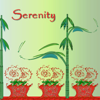
You saw this same flower pot in picture 1 on Saturday, but today, I thought I'd show you a variation of it.
On the same flowers, I used curlicue effects. The original tube I made was not colored in on the flowers. The colors in them on Saturday were kaleis.
On this version of the pot, I also used the warp tool which another favorite tool of mine. I just reshaped the pot to my liking after I did the curlicue effect.
I had made a stick of bamboo many months ago, and decided it would look good in this creation. I copied the first and then applied effects to it also.
To get the swirl, I took a third bamboo stick, and used the effect "wave". I liked the effect after placing it, and duplicated it and then mirrored it, and moved it up and made it smaller. Overall, I think the effects of the first creation came out very well.
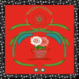
 This second creation is using the flower and pot again, but this time, I added a red background. I then applied a white background behind the red, and to get the white flower, I erased some of the red.
To get the pink flower, I added a layer on top of my red layer, grabbed my paint brush with some pink paint and just dabbed it where I wanted it, leaving some of the red to show through.
I redid the swirled bamboo stick from the previous creation, pasting it to the left of the pot and positioning it where I wanted it. I then duplicated and mirrored it to frame the flowers.
I grabbed another kalei flower I'd made to put in the center of the top swirl. The flower was also red, so I had to sharpen it to make it stand out.
From the original bamboo swirl, I selected the item that is bean shaped, copied it, and pasted it to a new layer and flipped it. I duplicated it again and mirrored it.
The two little squares at the bottom were from a previous kalei made months ago. I took just a small portion of it, and pasted it here.
The frame was added. After I choose the pattern I liked, which I picked up somewhere, I duplicated it and beveled it. I then put a shadow on the top and left side of the frame, went back to the original and put a shadow on the bottom and right side.
I always put my shadows on separate layers. You can apply affects to them also. They are also great for making silhouettes.
You can take a picture and add a shadow to another layer. When you "x" out the picture, only the silhouette remains. It's an interesting affect, especially when used together with a picture to show how they should look as opposed to what the character would like to be doing.
An example of what I'm talking about would be a picture of an angelic child. On a separate layer, you could put little horns on her head. Then you could add a shadow to the little girl layer, and to the horn layer, which would look like one shadow. You would then "x" out the horns or delete it. When the picture is merged, you'd have this angelic little child, but the shadow would show a devilish characteristic to them.
You could make the little angelic child much smaller, leaving the silhouette to show the child's hidden tendencies to always be "up to something".
That's it for today.
NOTE: The kittens are frolicking now. They no longer wobble along, but run and pounce. They are wild.
After returning from our dinner date with my kids last night, I actually touched one of the kittens. It was hiding in a bush. I separated the branches of the bush and reached in to gently stroke one of the kitties.
The hissing and spitting was unbelievable. I initially reacted to the spitting, as I've never had a cat spit at me before. I'd forgotten that they could do that. It threw me for a minute, but I resumed petting it till it managed to run like the dickens for the shelter of the hammock against the house and under the deck.
Have a great Sunday, and I hope you'll visit to see what I post tomorrow!

No comments:
Post a Comment